What does your visitors first do when they land your webpage?
I press down Command and hit + two times. Unless your page already looks like iA’s home page:
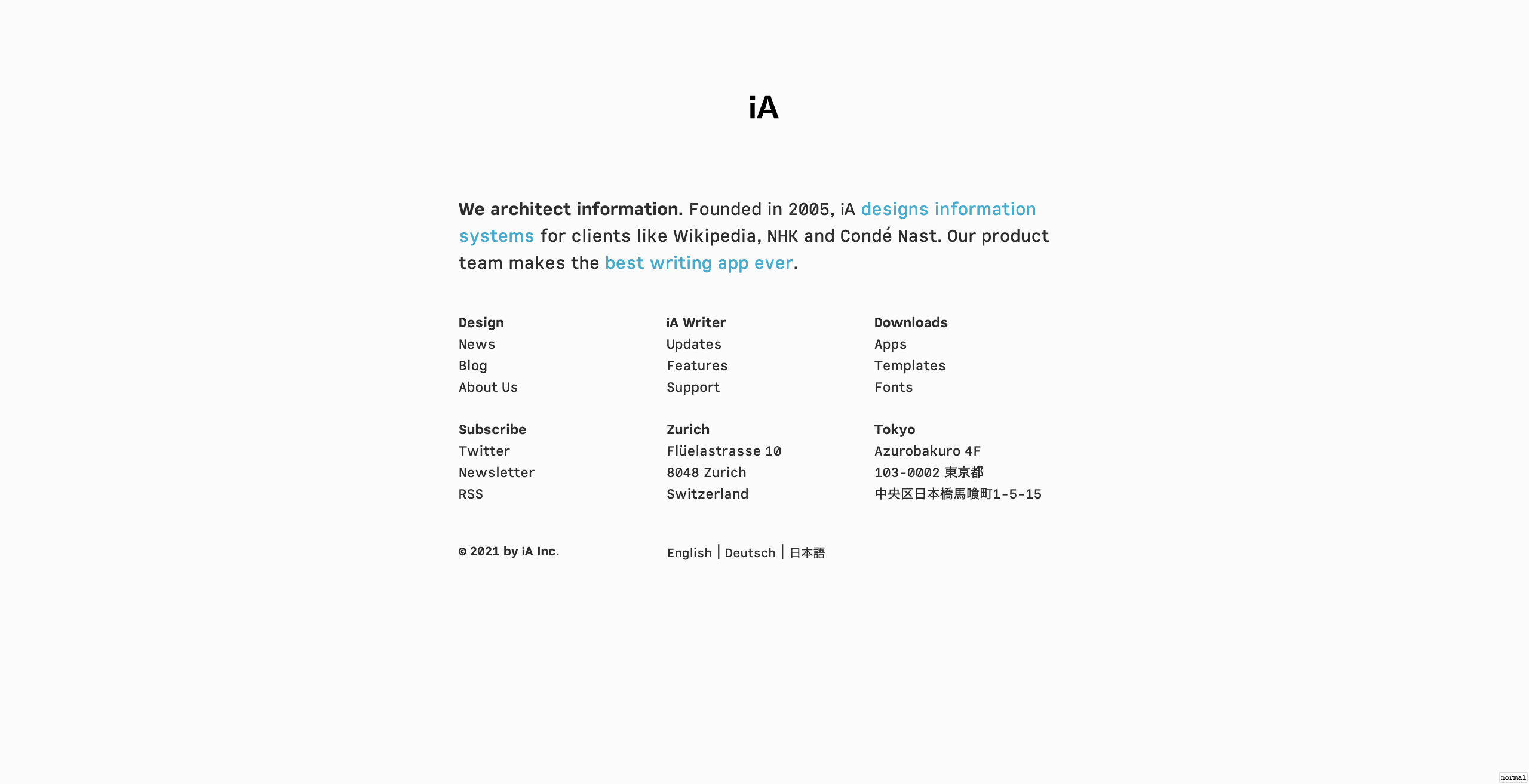
It’s hard to represent how large those letters actually are with a screenshot. They are really large, go check it out!
It turns out, I’m not alone in my discontent about font size on web. This became only more clear as I starting reading about web typography. Here are some basic rules that I learned, that improved readability on this page.
Before we start, a warning: Writing about typography on a blog that’s still so poorly laid is a bit… painful. Reading will be even more so. I’m moving away from the Jekyll theme I started with, but things are in transition, so bear with me ;)
1. It’s a matter of established principles, not taste.
You might ask “Why not just allow the user to choose the type size?” Well, adjusting type size is not a matter of taste, but a matter of reading distance. Since most websites and applications have an overly small type size, new customers would initially choose a type size that they are used to, that is: too small a size […]
from Responsive Typography: The Basics.
Oliver Reichenstein makes this point unreservedly. Before I go into how to choose the size… why in the first place did we get used to uncomfortably small type sizes?
Part of the answer is seems to be a bad alignment of stars in the industry. Richard Rutter notes that 16 pixels was often considered too large. I’m not sure if this is still the case. But in any case, if Rutter didn’t get what he wanted, it’s not surprising that most of the designers couldn’t.
Today, the default of 16 pixels seemed a good starting point to me. As a next step, I used a practical trick offered by Reichenstein: Take a book and hold it at a comfortable reading distance. Simultaneously, hold your digital device at it’s common use distance. Make sure the physical sizes of letters are the same. That is the correct size.
For this blog, I’ve chosen 1.25rem as the base of the modular scale, both for mobile and desktop. I haven’t overwritten the root font size, so these are relative to 16 pixels.
2. Choose a modular scale, not one size.
In the sixteenth century, a series of common sizes developed among European typographers, and the series survived with little change and few additions for 400 years. […] Use the old familiar scale, or use new scales of your own devising, but limit yourself, at first, to a modest set of distinct and related intervals.
from Elements of Typographic Style, quoted in Elements of Typography Applied To Web.
What is a “scale” when it comes to typography? Well, it’s quiet similar to a musical scale. It’s a series of numbers that make up a coherent set around a base size. The coherence provided by the scale helps your layout “make sense” to the observers.
One way of defining a typographic scale is choosing a “base size” and a multiplier, giving you a “modular scale”. The multiplier defines the ratio of each point in the scale to the next. For instance, a base size of 16px and a ratio of 2 would give you the scale: …, 4, 8, 16, 32, 64, … One idea that I liked is that you can use the scale for determining not only the size of font elements, but also designing the whitespace.
Tim Brown’s modularscale.com is a nice tool for choosing (and quickly implementing) modular scales. How to choose the ratio? In his post More Meaningful Typography, Tim Brown gives an example:
I chose the golden mean (1:1.618). It is a beautiful proportion with historical and cultural connections that make sense for the typefaces I’ve chosen and the text I’m setting. Although it is a contemporary design, Minion draws upon Renaissance ideals […]
I’m not a designer, and neither am I well versed in typography. So I find such judgements hard to make. For this blog, I’ve chosen two ratios: 1:1.06 for mobile and 1:1.2 for desktop, primarily because they looked fine for some spacing I want to implement soon.
3. Use unitless, responsive line heights.
According to Frank Chimero, you can have a “blog that’s superior to most with a couple lines of CSS”. One of those few lines is the CSS declaration: line-height: 1.5
The ideal line line height for your blog, however, also depends on the reading distance, like the base font size. The key thing here seems to be that the line height should help “promote horizontal movement” and make the lines of text feel like “horizontal lines, not woven fabric”, as noted by Laura Franz.
On the implementation side, the most surprising thing for me was the importance of using unitless line-heights, as noted by Eric Meyer.
I found 1.9rem and 2.03rem to play nicely with mobile and desktop settings I’ve mentioned so far.
There is more…
There is so much more.
But if you made it so far, here’s one more thing: the “measure”. Traditional wisdom suggests that your line width (or measure) should be 45-75 characters, or about 10 words.
I found a bit wider than 75 characters satisfying. And both Laura Franz (in her above linked blog post) and the iA folks (as reflected in their current choices) seem to agree.
While choosing the measure, I found Vasilis van Gemert’s “international measure slider” and Chris Coyier’s bookmarklet to colorize 45-75 character range of text elements text run very helpful in being mindful about how precisely I went against traditional wisdom.
I find that these tools make it more enjoyable to play with typography.
After all, this is a field where our perceptual abilities, representation capacities of our devices and fanciful aesthetic judgements clash and combine. Reading about it, tinkering with a few tools, and then making up one’s own rules is a lot of fun.